Skysmart: growing up without losing character

Client
Skysmart
Industry
EdTech
Deliverables
Web Design
Role
Design
Overview
Skyeng and Skysmart are Russia's leading online education platforms for adults and children. At the time of the project, Skyeng was the largest EdTech company in the country — with 84,600+ students, revenue growth of 141% YoY, and a top position in a market of 60+ competing platforms.
Problem
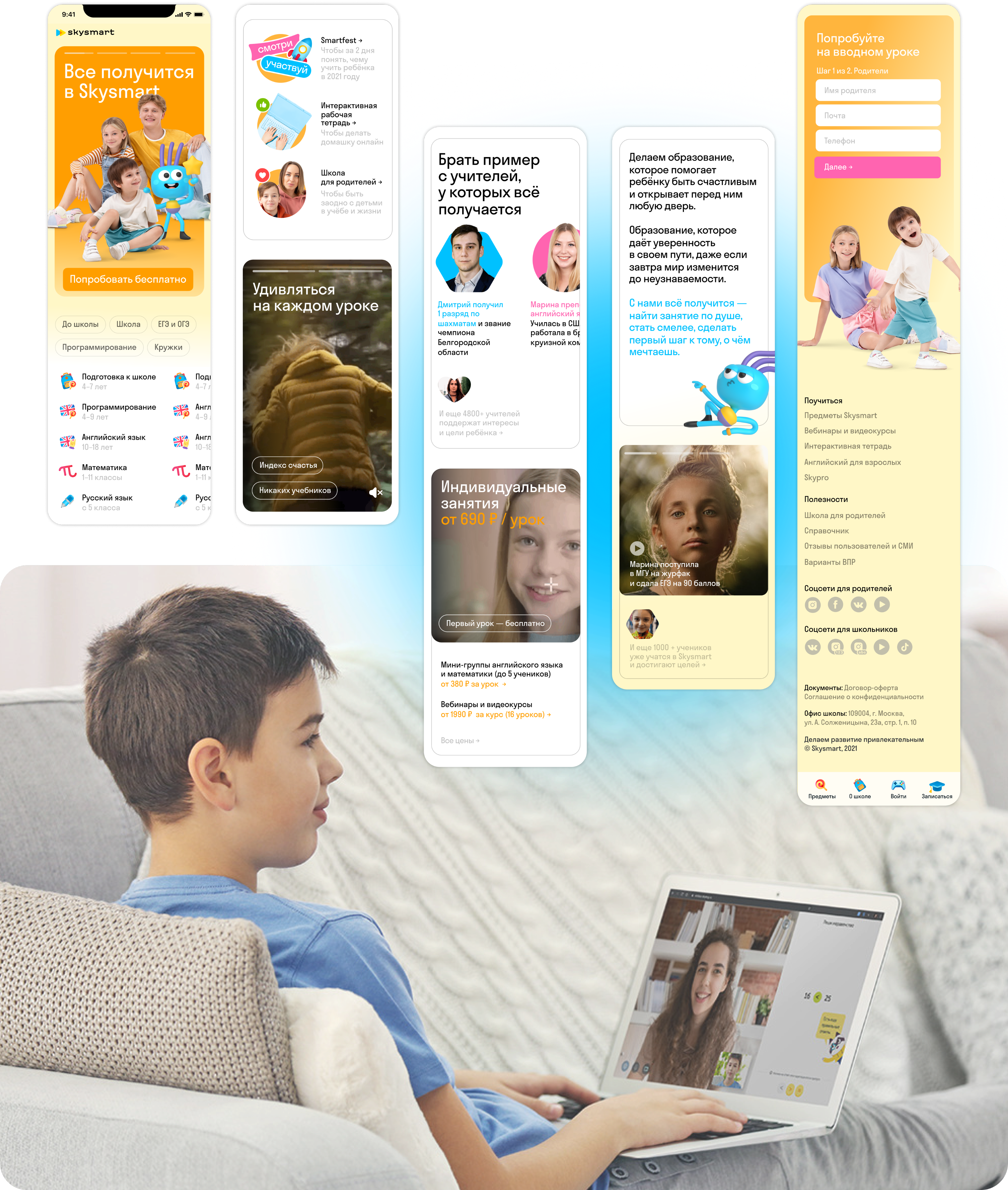
The main page no longer reflected the updated brand identity and needed a full redesign — not just visually, but in terms of user experience. The challenge was balancing creative ambition with the expectations of a large cross-functional team.
Goal
Redesign the main page to align with the new brand guidelines while improving user experience. The process moved through three stages — open brainstorming with 6 designers, narrowing down to the strongest concepts, and finalising with SEO adaptation and dev handoff.
Results
The redesign shipped and went live — a major milestone for a cross-functional team spanning design, development, editorial and product
Process and drafts
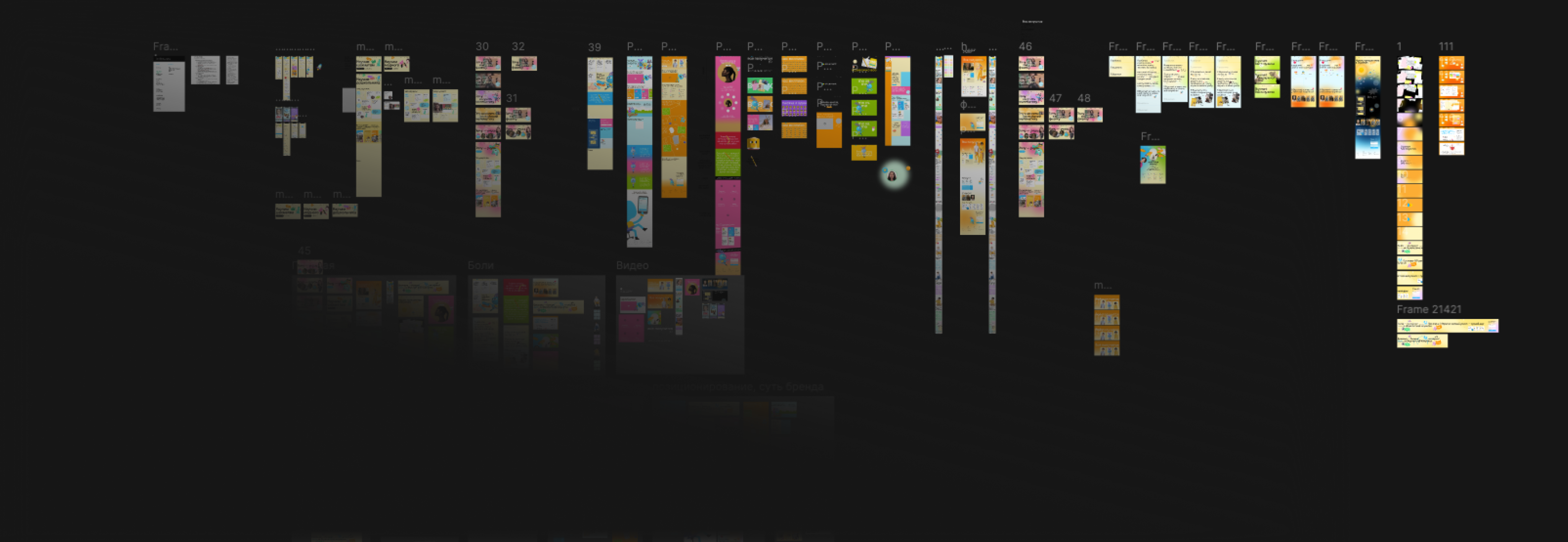
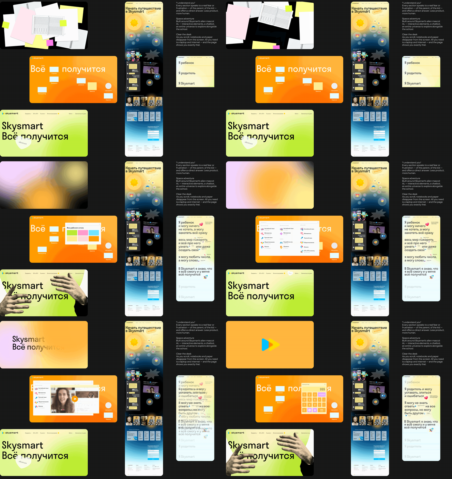
The design process had three stages. First, a open brainstorming session with 6 designers and an art director — as many ideas as possible on the table. Then sorting: the strongest concepts were combined into first drafts, and the team narrowed down to 3 designers — I was one of them. The final and longest stage was SEO adaptation, visual refinement, and preparation for development handoff.
Credits
Copywriting: Skysmart copywriting team
Development: Skysmart dev teamPMM: Evgenii Litvinenko
Illustrations: Ekaterina Veselova
Designers: Nikita Pushkin, Anastasiia Goncharova, Oksana Nalivaiko, Daniil Levinson
Home
Next project →


Skysmart: growing up without losing character
Client
Skysmart
Industry
EdTech
Deliverables
Web Design
Role
Design
Overview
Skyeng and Skysmart are Russia's leading online education platforms for adults and children. At the time of the project, Skyeng was the largest EdTech company in the country — with 84,600+ students, revenue growth of 141% YoY, and a top position in a market of 60+ competing platforms.
Problem
The main page no longer reflected the updated brand identity and needed a full redesign — not just visually, but in terms of user experience. The challenge was balancing creative ambition with the expectations of a large cross-functional team.
Goal
Redesign the main page to align with the new brand guidelines while improving user experience. The process moved through three stages — open brainstorming with 6 designers, narrowing down to the strongest concepts, and finalising with SEO adaptation and dev handoff.
Results
The redesign shipped and went live — a major milestone for a cross-functional team spanning design, development, editorial and product
Process and drafts
The design process had three stages. First, a open brainstorming session with 6 designers and an art director — as many ideas as possible on the table. Then sorting: the strongest concepts were combined into first drafts, and the team narrowed down to 3 designers — I was one of them. The final and longest stage was SEO adaptation, visual refinement, and preparation for development handoff.
Credits
Copywriting: Skysmart copywriting team
Development: Skysmart dev teamPMM: Evgenii Litvinenko
Illustrations: Ekaterina Veselova
Designers: Nikita Pushkin, Anastasiia Goncharova, Oksana Nalivaiko, Daniil Levinson
Home
Next project →


Skysmart: growing up without losing character
Client
Skysmart
Industry
EdTech
Deliverables
Web Design
Role
Design
Overview
Skyeng and Skysmart are Russia's leading online education platforms for adults and children. At the time of the project, Skyeng was the largest EdTech company in the country — with 84,600+ students, revenue growth of 141% YoY, and a top position in a market of 60+ competing platforms.
Problem
The main page no longer reflected the updated brand identity and needed a full redesign — not just visually, but in terms of user experience. The challenge was balancing creative ambition with the expectations of a large cross-functional team.
Goal
Redesign the main page to align with the new brand guidelines while improving user experience. The process moved through three stages — open brainstorming with 6 designers, narrowing down to the strongest concepts, and finalising with SEO adaptation and dev handoff.
Results
The redesign shipped and went live — a major milestone for a cross-functional team spanning design, development, editorial and product
Process and drafts
The design process had three stages. First, a open brainstorming session with 6 designers and an art director — as many ideas as possible on the table. Then sorting: the strongest concepts were combined into first drafts, and the team narrowed down to 3 designers — I was one of them. The final and longest stage was SEO adaptation, visual refinement, and preparation for development handoff.
Credits
Copywriting: Skysmart copywriting team
Development: Skysmart dev teamPMM: Evgenii Litvinenko
Illustrations: Ekaterina Veselova
Designers: Nikita Pushkin, Anastasiia Goncharova, Oksana Nalivaiko, Daniil Levinson
Home
Next project →

